Featured

Visualize our blog now possible


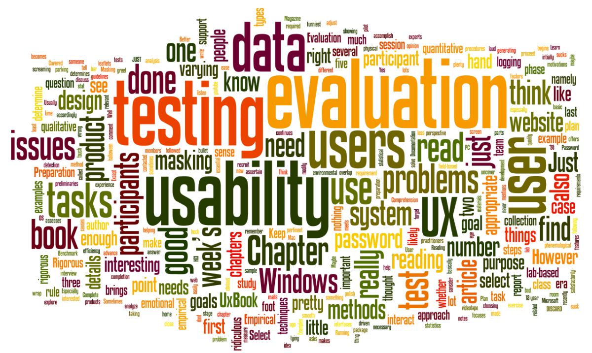
After Dr. V. emailed me the midterm evaluation. I was very impress about the word cloud, it help me identify what was the most important characteristic other teammates think about me immediately.  Find out it was a web tool call Wordle makes this possible.

Here is my UX blog in a glance

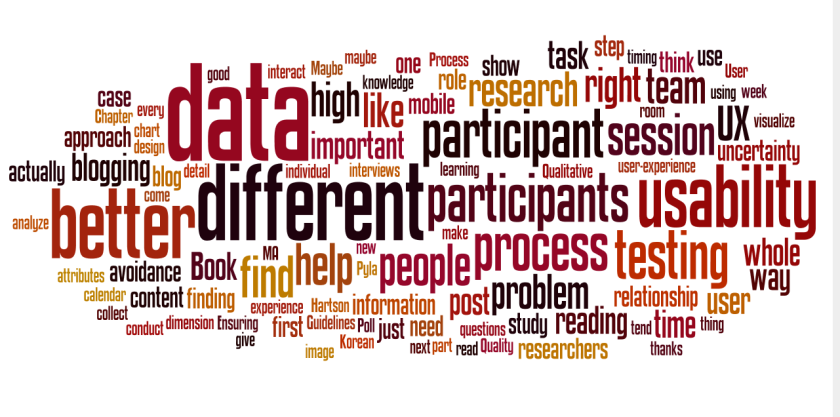
And I create a feed for all our CGT 512 class blog,

Here is the word visualization of it:

I am so happy I found this tool, this way is easy to find users or experts trend about any topic quickly. And maybe change my focus toward more user-centered.

Go try it yourself, but watch the time! Please let me know if you come across other great data visualization tool. Thanks.

Featured

Just scratching the surface of Ux.


Hartson, R., & Pyla, P. S. (2012). The UX Book: Process and Guidelines for Ensuring a Quality User Experience. Waltham, MA: Elsevier Science. Chapter 1-2

After reading the first two chapters of this new Ux (User experience) book, the knowledge I have about the topic of Ux seem elementary and sallow. But this gives me more confidence in learning more new and useful knowledge during this Ux course.

In Chapter 1, the author discussed the development and history of the UX and helps the readers to understand many blind spots and mistreated issues in this topic.

The concept of disconnection of absorption (Section 1.4.1 ) caught my attention, quick often I try to focus on two or more things at the same time during my design process (especially in web page design). People are so easy to be detracted from the overwhelming information on the same page.

And how about fun at Work (Section 1.4.5 ), the balance between fun and efficiency in work situation . This can really depend on the type of work, emergent or non-emergent work. Fun, aesthetics, and joy don’t have to be compromise if we think about the worker’s needs. This reminds me a video about the human emotion and user experience by the famous Norman Door inventor, Professor Donald Norman.

In Chapter 2, the analysis process in the cycle of UX activities is the most challenge concept to me. To “understanding the business domain, user work, and user needs”  will be a really good point for me to pay attention and ask questions in class. I think too often we dive into the design process before we even understanding anything about the users.

Last, what can be the best to know that a graduate student is important in the world of UX when I read the quote by Phyllis Reisner

Human factors is about making things work better for people. For example, think about building a bridge: You use theory, good design practice, and engineering principles, but you can’t really know if it will work. So you build it and have someone walk over it. Of course, if the test fails, … well, that’s one of the reasons we have graduate students.

Norman, D. (2002). The Design of Everyday Things. Jackson, TN: Basic Books. Pg. 1-33

In Professor Norman’s book, I learned one really good user design principle, if we spend the time to learn about the user before designing a product is more efficient than to fix the usability problem after designing a product.

If you are read till here, please tell me your reading experience. So I can write better next time.

Thank you!

Featured

Design and desire what you want to learn.


Thank you Dr. V. for helping me think when you said:”Design what you want to learn, take charge of your education!” in the first CGT 512 Class.

After listening to all my classmates’ self introductions, I realize everyone come from different background, and different goal in life. It is hard enough to design a product to fit most people’s need or a group of people’s need (like CGT master students), let alone to design a educational program to fit different people’s need. I believe this is not only our professor’s job, but our reprehensibility to desire what should we learn. And we are not doing it alone, each of us can play a vital role with our strength. It take me two years master study to realize the important of learning it your way and together at the same time.

My wishes is everyone will have a vision of how can your education be benefit to you life after this semester classes end.

Happy Blogging and commenting!

Well, usability blogs where are we go from here?


After a great semester of blogging about UX, and reading many interesting blog posts from all my friends in class. I think I will really miss the interaction in class, as well as everyday try to check it there are any comments to reply.

But now come to the end of this course, it this the end of our blog? To many of you maybe, but you can choose to continue this journey on UX research and discovery. If you are passion about UX design, this definitely a great start and addition to your career portfolio.

Other things can make our blog more user-centered after the grading of our blog:

1.  Change our categories name to more user-centered, like Class RAA can be called User-experience Research Article. [Don’t confuse our readers, especially our potential employer]

2. Add a new useful resource tab to show readers some useful UX blogs, tools, websites, and etc. [Help reader to quickly locate useful information, and this can help other to search our blog]

3. Continue finish reading all the blog posts from our classmates which we had missed and leave comments. [Learn more, encourage everyone to keep blogging outside of the class]

OK, enjoy finals and keep on blogging on!!

Discover secret message from WordPress, it this user-centered? Or an April fool joke?!


Have you ever use the revision function in WordPress, when I was trying to compare revision but suddenly,

Compare Revision

A secret message appear, it is Danger!?

Danger!01Danger!02Danger!03 Danger!04 Danger!05 Danger!06

Is this part of the April fool matrix joke, and why I have to wait for the message to type out?

Try it yourself, scare your friend, maybe! I don’t think this is user-centered, maybe designer think this is funny, but this can make the user feel bad and helpless.

RAA5: Usability of interactive systems: It will get worse before it gets better.


Johnson, J., & Henderson, A. (2012). Usability of interactive systems: It will get worse before it gets better. Journal of Usability Studies, 7 (3), 88–93.

I think what will be a better article to end this semester than an article about the history on Usability of interactive design and what is the trend for future interactive system. I never think this could be the case for Usability, but the result is surprising to me.

After 30 years of first CHI (Computer Human Interaction) conference, we can assume the world, especially in industry should clearly see the important of user-centered UX design. Many company are rushing to create these own UX design department over the decades. But this article’s literature indicates more and more cases company roll out new product with little or no consideration of interaction between the users and the company products.

Why would company do that? One good example the author listed, a brand new toaster with 14 different button and LED display. Really?! Companies need to roll out new product to drive sale, but companies do not need to scarify the user’s need. Users are not coming to buy a computer, but an useful product to fit their needs. Instead companies are trying to reshape the user’s thinking, if the product is hard to use, oh well it is assume that user made a mistake.

Top or Bottom: Your Choice?

Another cause of producing bad interactive product directly relate to UX designer’s decision making power in the company. In many companies decision making rely on manager or executive level, without a great support on UX design is hard for company to create pleasure to use product. And I can speak from my own experience, many time manager or maybe a project team comes seek help for advise on interactive design, but at the end, most of the suggestions are ignore and create product in their own opinion. Sometime even the same people come for help end up angry on the UX designer.

We should be a team, let UX designers do their part to help creating greater user experience, so that other team members can do what they are best. A great product can become a better product at the end.

[Images thanks to http://4.bp.blogspot.com/__GzFWVCm8Rw/SyjIGa20AdI/AAAAAAAADAY/J58pEVq-fU4/s1600/toaster3.jpg

http://www.cuisinart.com/share/images/products/zoom/cpt-440.jpg%5D

RAA4: Developing a useful, user-friendly website for cancer patient follow-up


BARTLETT, Y.K., SELBY, D.L., NEWSHAM, A., KEDING, A., FORMAN, D., BROWN, J., VELIKOVA, G. and WRIGHT, P. (2012), Developing a useful, user-friendly website for cancer patient follow-up: users’ perspectives on ease of access and usefulness. European Journal of Cancer Care, 21: 747–757. doi: 10.1111/j.1365-2354.2012.01357.x

It is so great to read that people who care about usability, and they are work actually help people, especially people in need. The research shows with the right approach even user with preferably physical follow-up by clinical specialist finds the website have many benefits to them.

Purpose:

Use the usability finding to create and evaluate a website for cancer patient follow-up to improve the ease of access and usefulness.

Method:

This study split into three parts of study:
1. Develop the follow-up website utilize the feedback from focus groups and interviews of outpatient of the hospital. And along with the help of a clinical IT specialist.
2. Collecting user data from the computer and Internet Usage Survey
3. A crossover study with patient with internet access. Tracking their website usage and finishing web survey, and follow up with telephone interview.

Analyze & Finding:

Part 1: Website development

14 females and 7 males participants, the developer need to combine the user experience with some concern about the bona fide (information copyright) nature of the website. Most important three elements to the user is a personalize login page with their own cancer-specific, a message question and answering system can provide easy feedback on specific question, and chat room to connect with local patients and professionals.

Part 2 Computer and Internet usage survey

Although 67% (238/353) patient consented, find out many participants still will prefer paper and face to face follow-up. And one finding indicate only employment status remained a significant predictor of Internet use. This is similar finding like my last RAA post.

Part 3 Crossover study and interview

Great feedback on the website follow-up system in all aspects of usability, feasibility and acceptability. Usability study from the beginning helps develop a user-centered web site to benefit and encourage user to utilize the web site.

From my stand point, many of these usability data are collected from volunteers patients, many times think about intuitive ways to interact with users, you will find  many resources is available to you.

Sort by Magic, who is using it really!


Did you notice when you use google reader, now you can sort your rss feed posts by “Magic”

What does this mean? Find out this sort option provide a more personalize ranking for individual user by learning what are the most interested posts to individual over time. Does this mean just like google search, you never know what you really will get? (half of the time, you have http://www.ask.com in your first 5 search result, really?)[find more information post]

And this playful name is kind of confuse to me just like other product “I’m Feeling Lucky” button in the google’s home page. Those feature’s name are not only confusing to the user, ironically, it costs the company 100 million dollars a year when 1% user search directly go to the website bypassed all the google ads. Does this means playfulness sometime have great cost? Great idea needs to back up by good user data in order to create great product at the end.

Do you use these features at all? What should we rename them?

Difficult process but where all the value come from: Analysis and Evaluation


UX Book Chapter 16 & 17

Hartson, R., & Pyla, P. S. (2012). The UX Book: Process and Guidelines for Ensuring a Quality User Experience. Waltham, MA: Elsevier Science.

After last week post about preparing and conducting usability testing, this week reading on analysis and evaluation are more difficult but I believe where it make the different in the whole usability study process.

One thing I find really helpful in the book is the author use the metaphor of the process of the diagnostic of a disease, from finding the problem to treatment to cure confirmation. Some time we thing treating the problem is just to fix the problem immediately.  But actually is the more important in life to find out what really cause the problem, and change our thinking instead fixing the problems on the spot.

Another principle for me to live by is don’t just fix problem, make sure the fixes are not causing new problem. So we won’t dive into a endless cycle.

Just one another point (I promise), how to present the data? Pie chart, bar chart on and on. But maybe we can think of better way to visualize of data is very important. A good image worth a thousand word and more. Not only 3D data visualization, but maybe 4D with time changing, this way we can find trend of the data in a boarder scale.

Be wise to use and present the user data you have work so hard to collect!

[image thanks to http://tumrai.com/images/e/e7/Time_where_we_live.jpg]

Selecting the right people for the right task. Well, in our case four people have to do it all.


UX Book Chapter 14 & 15

Hartson, R., & Pyla, P. S. (2012). The UX Book: Process and Guidelines for Ensuring a Quality User Experience. Waltham, MA: Elsevier Science.

After reading the preparation and conducting usability testing session for rigorous empirical evaluation, something stand out to me. How should we selecting the right people for the right task, both the usability designers and usability participants.

Having a facilitator to help the session to go smooth. A prototype executor help individual task detail. A quantitative data collector to help record error number. task timing, and etc. A Qualitative data collector to record any observation or emotion data from the participant. And of course other supporting actors to help interact with participant for the specific task. Feel like this will be a room full of people. Seeing photos about the UX Lab at Bloomberg LP (pg. 517), the designers illuminate distraction by putting different people in different room to do observation, recording without the participant’s knowledge. And actually only a few people to interact with participant.

But in our class research group, four people are actually doing all the tasks during an usability testing session. We need to better understanding each team role match with the right team members. Maybe one person will have more than one team role. Also we can rotate team role to help each team member to learning different part in this process. Another thought, every usability testing session should be a learning process for the next, we will have to address different issues or problems, so that we can conduct a better session next time.

Picking the right usability participants should be a balance process. Although all participants should be potential user of our product, picking different knowledge level user is important, so the result can better reflect the general population of users.

Be prepare and pay attentions on the unexpected during the testing session, come up with better and more intuitive ways to gather user data, this is my advise. Practice makes perfect!

[Image thanks to http://pulllava360.saturn.netdna-cdn.com/wp-content/uploads/2012/03/Looking-for-the-right-person.jpg]

When should we blog? Come cast your vote!


When do you do you blogging?
How to blog with an user-oriented approach , or a writer/designer oriented approach?
When do you think your blog post have a higher chance to be read?


Designer-oriented

User-oriented

It is important to design your blog post tailor to the reader’s needs both timing and right contents.

And after reading the midterm evaluation report from Dr. V., I realize blogging it did not come natural to me at first, I am still having trouble sometime.
Maybe this is your case, don’t give up, just keep at it. When you see other people read and benefit from your post, you will do better and better.

Here is my blogging calendar, feel free to add to your own calendar. Let us finish this semester strong, and more we can utilize what we learn in the future.

https://calendars.office.microsoft.com/pubcalstorage/93cswt6z3399077/CGT_521_BloggingAssignment_Calendar.ics

Again enjoy blogging!

RAA3: Culturability in Mobile Data Services


Boreum, C., Inseong, L., & Jinwoo, K. (2006). Culturability in Mobile Data Services: A Qualitative Study of the Relationship Between Cultural Characteristics and User-Experience Attributes. International Journal Of Human-Computer Interaction, 20(3), 171-203. doi:10.1207/s15327590ijhc2003_2

After reading this massive qualitative research articles, it gives a through of going through CGT 512 Class all over again. The research data and information can years to collect, and analyze all the data can take the same amount of time. But every part is well relate to article, researchers fellow a step by step approach give both the researchers and readers a good structure of the whole research. In this case, I am glad I can find an article which help me understand the whole process of usability testing and analyzing step by step, and the finding is promising.

Purpose:

Conduct qualitative study using usability testing and interviews and analyze the data in order to develop critical mobile design features across three different culture Korea, Japan, and Finland.

Method:

Grounded theory method is applied throughout the whole research. The researcher first did a test study on 5 participants, so they can better revise the research questions and process. During data gathering, researchers selected 24 participant from three different country Korea, Japan and Finland with only experience in their own country’s mobile device to conduct interviews using use case video clip along with different mobile user experience questions.

Analyze:

The data was carefully analyze with a like/dislike and mention by participant scale, and find relationship between during categories. Researchers focus on the culture dimension and user-experience attributes.

Finding:

Many interesting finding after systematically analyze all the data, first of all the Korean participants show, high contextuality, high uncertainty avoidance, and collectivist inclinations. They want to connect with friend with different way of sharing, and they also like detail of content, more information the better.

The Japanese participant reveal they are tend to be high contextuality, high uncertainty avoidance, and fairly high individualism. They don’t like to share their interest with others. They tend to find content fit their own individual need instead the need of everyone else.

Compare to the Korean and Japanese participants, the Finnish participants have the opposite characteristic with low contextuality, individualism, and low uncertainty avoidance. The Finish participant like to explore new content, and they are proud to be unique and like to show it to others.
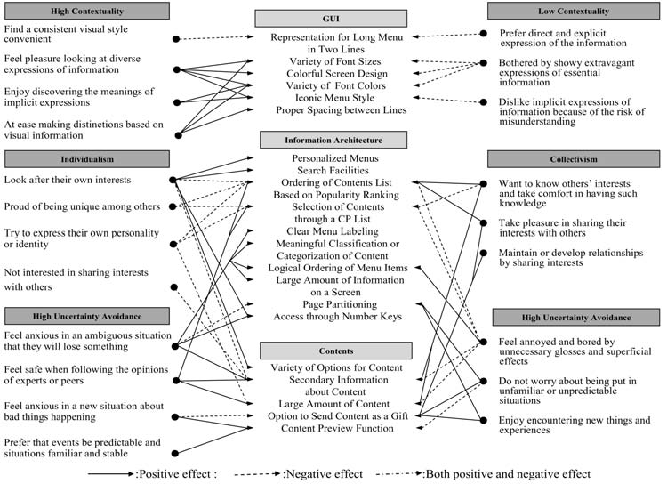
And this general model show the different relationship between the culture dimension and user-experience attributes. Personally, I think there can be a better way to visualize these information. How will you visualize these relationship?